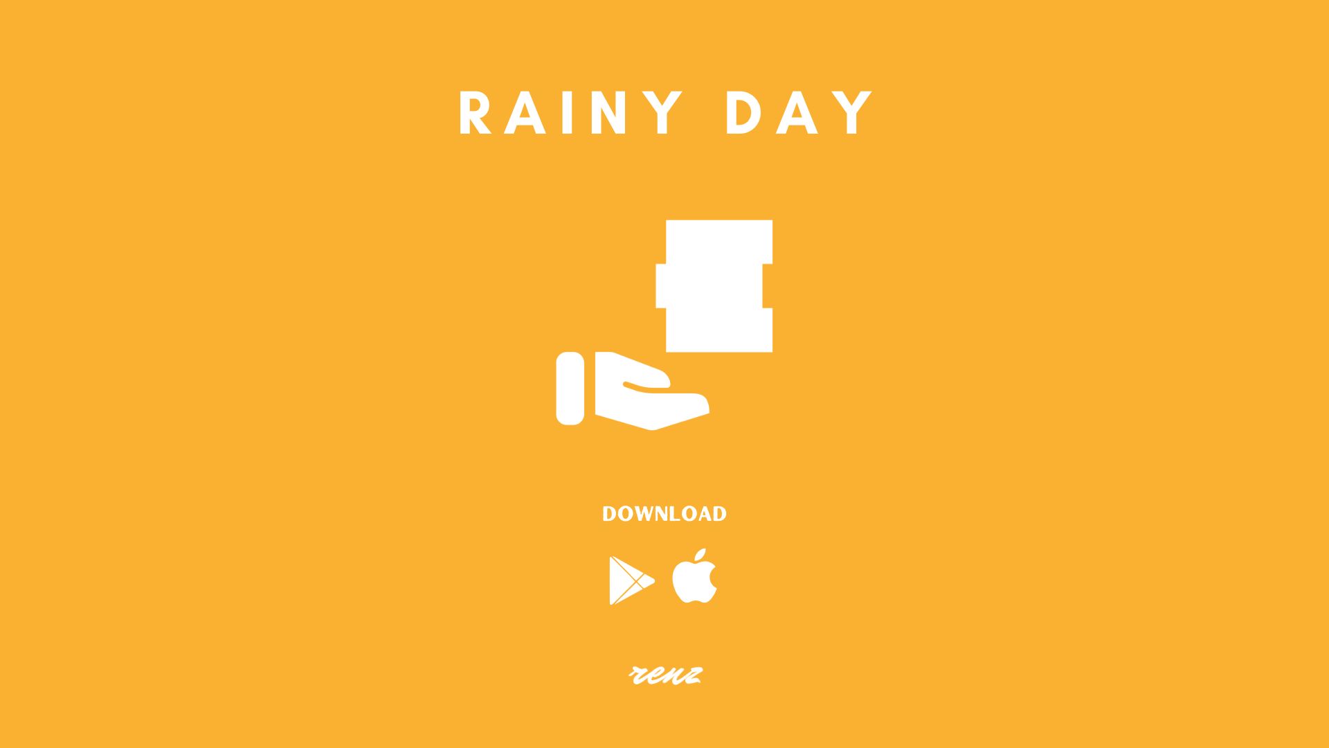
Rainy Day
Fresh New UI/UX for an Upcoming Beta! — Devlog #9
Hello world! Hello Frenz.
If you’re here for the tips, tools and resources I’ve used for UI designing you, can skip over to Tips, Tools and Resources for UI Design using the table of contents.
For those interested in the devlog, welcome! I’ve been working on a beta for my financial literacy game called Rainy Day and feel ready to make it happen in my next devlog!
Before I get into it, I just want to quickly say that I’ve been trying to get this game released before the year ends but its just not possible. The thought of it all just keeps delaying me in updating everyone with what’s going on. There are a lot more to work on and they just keep coming as I go.
So, here’s where Rainy Day is at. I have been working on making the game look better and provide better user experience.
Localization
 The first step I took to better user experience is for the game to consider the top countries in which mobile games are very popular, hoping to localize and speak the same language as the users. As of now, it’s just the tutorial mode and the main menu that I have localization setup for but the system is there ready for me to localize all of the texts within the game. One neat thing is that Unity makes this easy and even has a debugger to easily switch languages.
Personalization
Right after the language selection prompt is another prompt for the player to input their username. This is information that I can use not only on the leaderboard but somewhere else in the game to give that feeling of connection like when someone says your name in real life. It’s another feature that I can think of for the next devlog.
Tutorial Mode
Once everything is set up, the player then goes through the tutorial in which they learn the simple game mechanics of movement, how the deposit mechanic works and such. The wording in the tutorial for sure needs a little more work but as of now I think it already does a good job in preparing players for all the round of gameplay (hours) they may play.
Visual Changes and Game Feedback
Some of the visual changes made so far to improve the overall experience:
- Curved blocks made in and imported from Blender
- Moving objects in play leaves a disappearing trail following their movement
- Scoring text bounces or shakes everytime it goes up or down respectively
- Text popup appears for successful stacks
- Clamped player movement to the ends of the screen and adjusts when the camera zooms in/out
- Deposit prompt appears once the player reaches the 40% performance threshold for the round of gameplay that enables them to clear their stack and continue on
Matching the Mechanics with a Theme
And aside from everything else listed above, the game now has a sense of theme that supports the game mechanics and vice versa. The buttons on most screen are organized in a stacking pattern and have the different colors as well as sizes of the falling money seen in the actual gameplay.
With these buttons, I try to prioritize one over the other based on the actual value of their colors: first being the honey yellow, second being the sheer green, and last being the grullo color. The stacked look also naturally allows me to design the highest object in the stack to be the button I want most attention on.
This use of color and natural prioritization is now all over the game. Objectives (referred to as bonuses in the game) are colored based on the value of their reward, the player is highlighted on the leaderboard with the highest value associated for color which again is honey yellow, and much more.
The countdown before the start of every hour also has a stoplight design style now that perfectly fits the theme of the game! As a nice little touch, I’ve also added a quick preview of current bonuses during the countdown.
New Upgrades!
I’ve also added more content for the game that is aligned with providing subtle financial literacy or awareness for players:
- Savings Acccount Upgrade — this has been added to the game to lock the stock feature in the game and give the general advice of having a readily available decent saving first before trying to invest. This upgrade also has daily returns higher than the common percent return (3% or so) provided by big banks to hopefully inform players that there are places to put their readily available money where it can actually grow.
- Business Account Upgrade — a feature I thought I should put in the game for players who want to put in more ‘hours.’ The idea is literally just that. It will give players more hours per day to gain income and it’s somewhat of a way to let players know there are other ways to earn money than a 9-5 job with side hustles, monetized hobbies, etc.
Tips, Tools, and Resources for UI Design
- Game UI Database To start this section off, it’s generally good to have an idea on paper or something of how you want your UI to look. A resource I heard from a good friend of mine to help generate ideas is a website called Game UI Database. It’s self explanatory and will help you find something to base your design off of. Don’t forget to look outside of just video games for inspiration as well. Wealthsimple for example has heavily inspired the design of Rainy Day.
- Coolors Next would be to pick and stick to a color palette and Coolors makes it super easy. You can literally just click a button to continually generate color palettes. It allows you to lock colors you liked as well so that it stays everytime you ask for more different colors that goes with it. And once you’re satisfied you can export your palette for free. I would also like to mention an extension for Mozilla that I’m sure has similar available products out there called ColorPick Eyedropper. Tools like this help in figuring out the exact color of the designs you may have been inspired with so you can use it how you want in your design.
- Google Fonts/Icons Let’s get over the need to know information that this google font and icon resource is free for commerical use.
Fonts have expression and communicates a lot to users about designs more than we realize so having access to a whole bunch of them to choose from for your design is great. And to go with the fonts are the icons as well to really nail down what your are trying to communicate.
Support My Work and Have Your Name in the Game!
Rainy Day should be done soon and as usual, subscribe on here or on your preferred media in my LinkTree to stay updated! And if you are ever interested in having your name forever embedded in the startup screen of the game, or be named after a stock, consider doing a top donation subcription tier on my website! Anything helps so even a free subscription on there is huge and you will be emailed a link to beta test Rainy Day once it’s available.
December Donators
Thank you for listening and special thank you shoutout to my website supporters who donated in December!
- Laura Milligan
Leave a comment
Log in with itch.io to leave a comment.